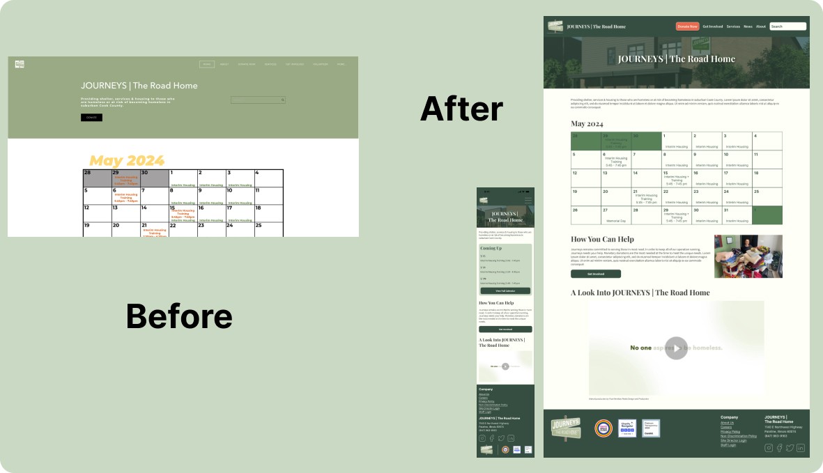
Journeys - The Road Home is a non-profit organization based in Chicago Journey's is a non-profit that aims to provide shelter, stability, and resources to homeless individuals and those at risk of homelessness. The organization provides food and clothing services, access to showers, mental health resources, and more. We are looking to redesign the current Journeys website to improve the usability of the site by conducting heuristic evaluations and competitor analysis, as well as getting in contact with a member of the organization to better align with their goals and needs.
Overview
The current website for Journeys lacks visual appeal and consistency, with spacing and layout inconsistencies, text variations across pages, difficult-to-find hours, suboptimal navigation links organization, and poor contrast in the search box.
Problem
Our solution involves redesigning Journeys' website to ensure uniformity in text, style, and spacing while incorporating more visually engaging elements such as photos. This approach aims to create a cohesive and welcoming online experience that effectively communicates Journeys' mission and encourages user engagement.
Solution
Figma, Google Drive, Zoom
Tools
UI UX Researcher & designer (Group Project - with work devided evenly through out the project)
My Role
3 weeks
Timeline
UX/UI Design
Wireframing & Prototyping
User Research & Usability Testing
Ux Techniques

User Research
To collect our qualitative data, we will conduct 5-6 verbal interviews. Each 1-on-1 interview will be held in person or over zoom. The interviews will be recorded and notes will be taken to record the responses of the interviewee.
What are the most prominent pain points of the current website?
What main purposes does the website serve to its users?
What would deter a potential volunteer from signing up for a non-profit organization? What would encourage them?
How do communities stay up to date with their local non-profit organizations?
How can the website be revised to cater toward both of its target audiences?
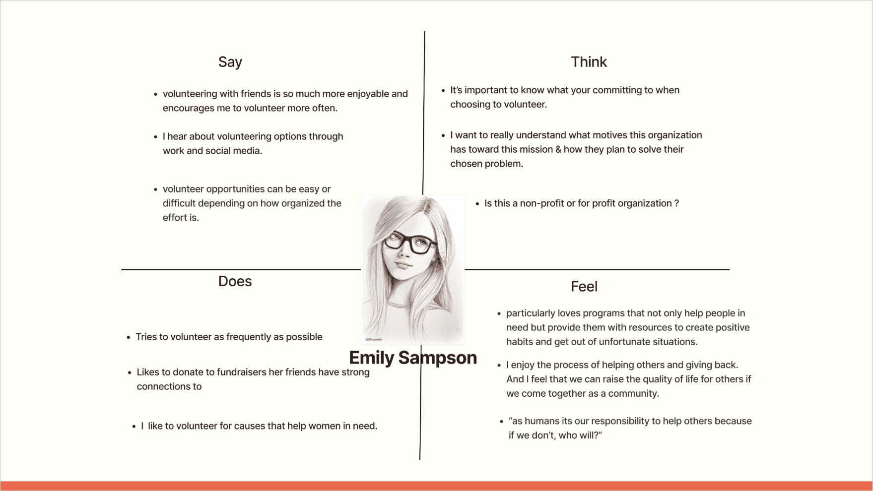
User Persona
Afinity Diagram

Definition & Synthesis
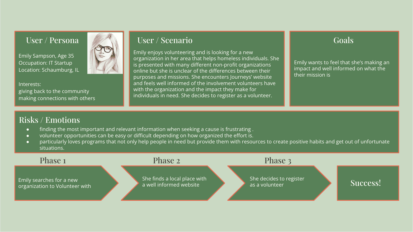
The analysis of the research further shows that Journey's website currently faces significant usability issues and inefficiencies in the distribution of information, which hinder its ability to effectively serve the volunteers or the people who require the organization's efforts.
Problem Statement

Story Board

User Scenario
Ideation
In the ideation phase was spent considering how to best improve the key usability concerns. Such as:
Enhance Usability: Create a clean, intuitive, and easily navigable interface that allows users to quickly find the information and services they need.
Improve Accessibility: Ensure the website meets or exceeds web accessibility standards to provide equal access for all users, including those with disabilities.
Streamline Information Distribution: Implement a robust content management system that ensures timely, accurate, and clear communication of important information.
Update and Maintain Content: Establish protocols for regularly updating content to keep information current and reliable.
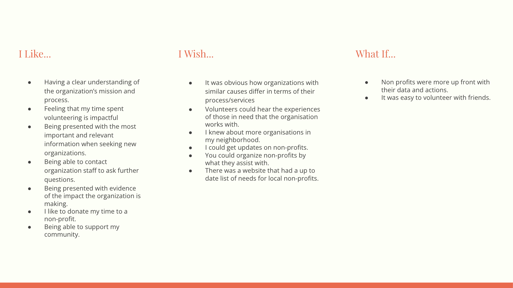
I Like, I Wish, What If
Feature Prioritization Matrix

User Flow

Compeditor Analysis

Prototyping
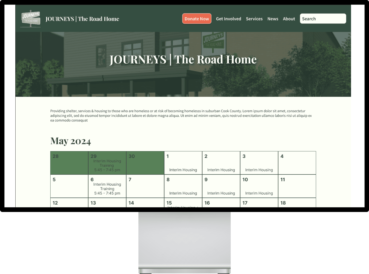
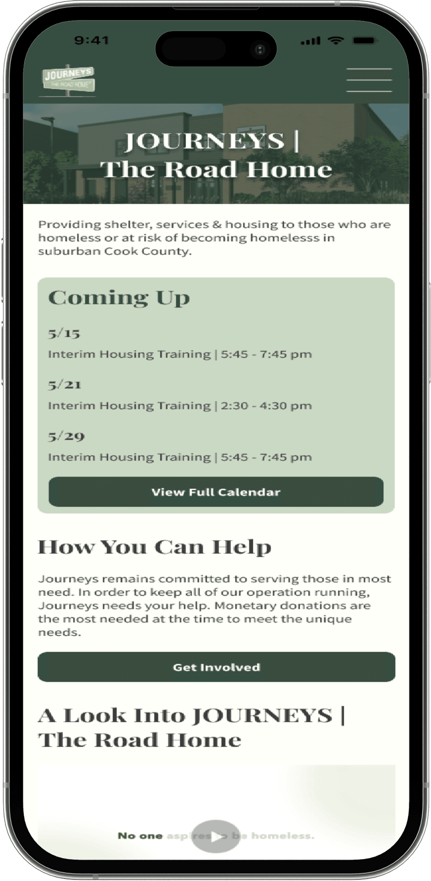
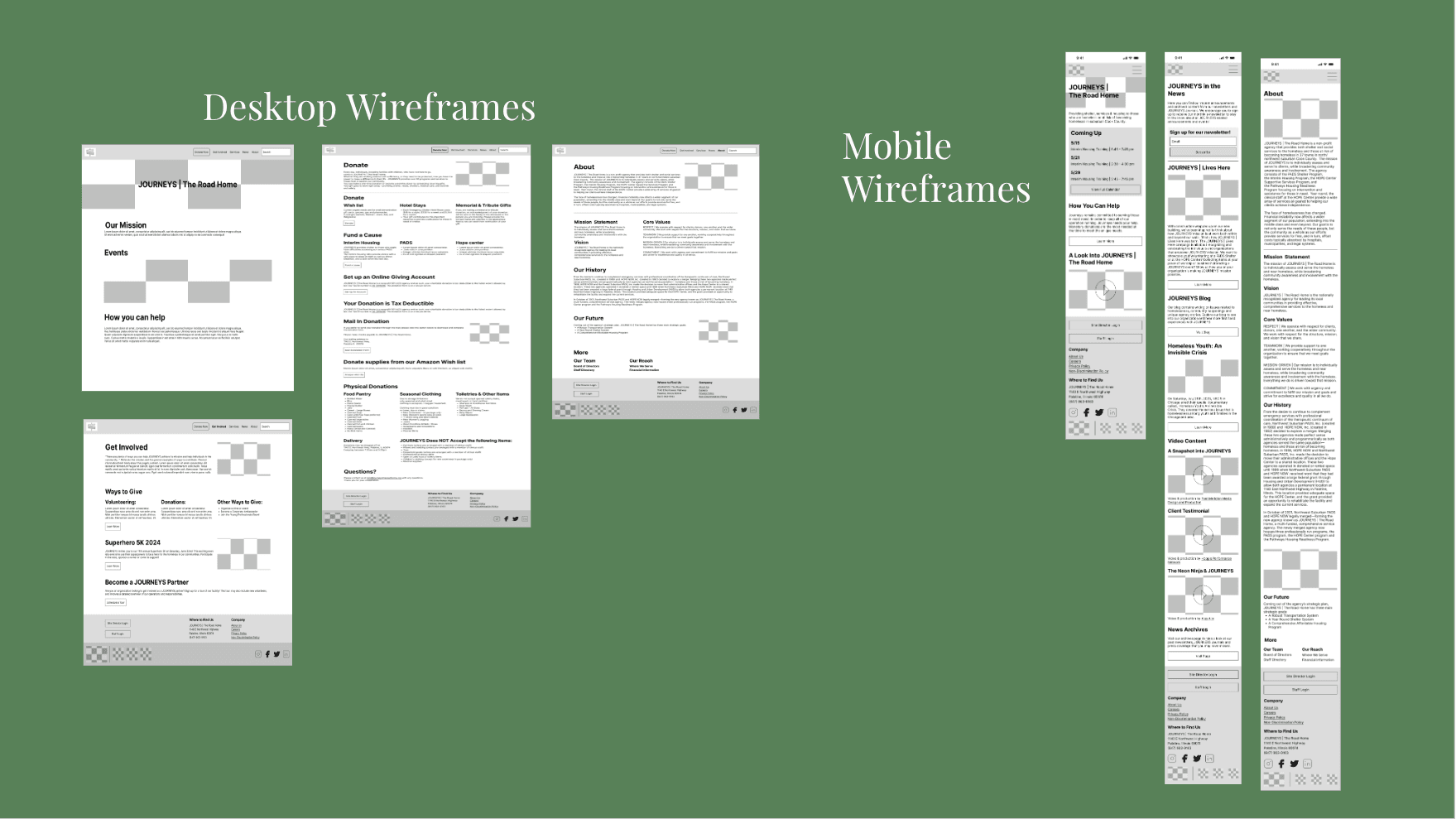
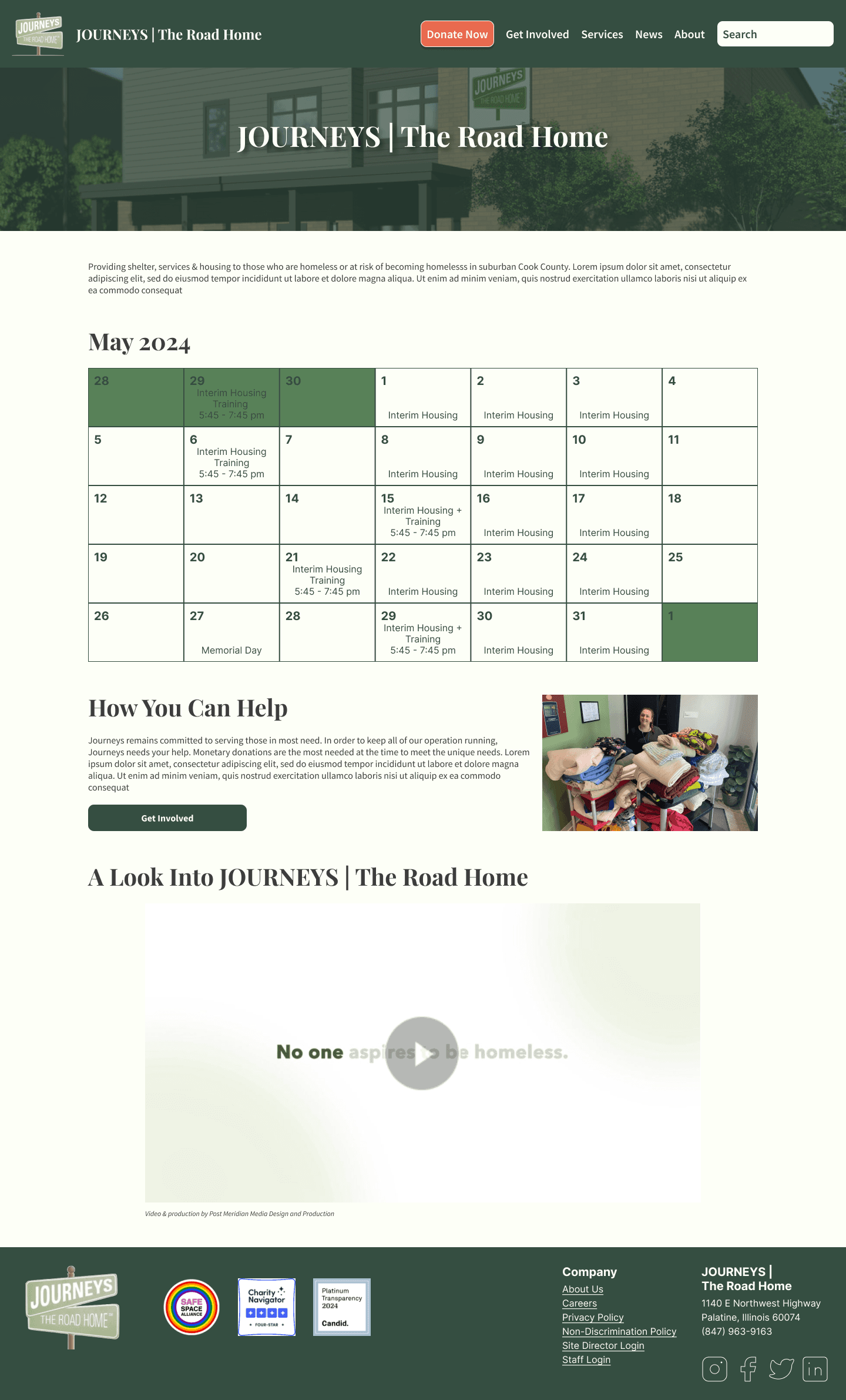
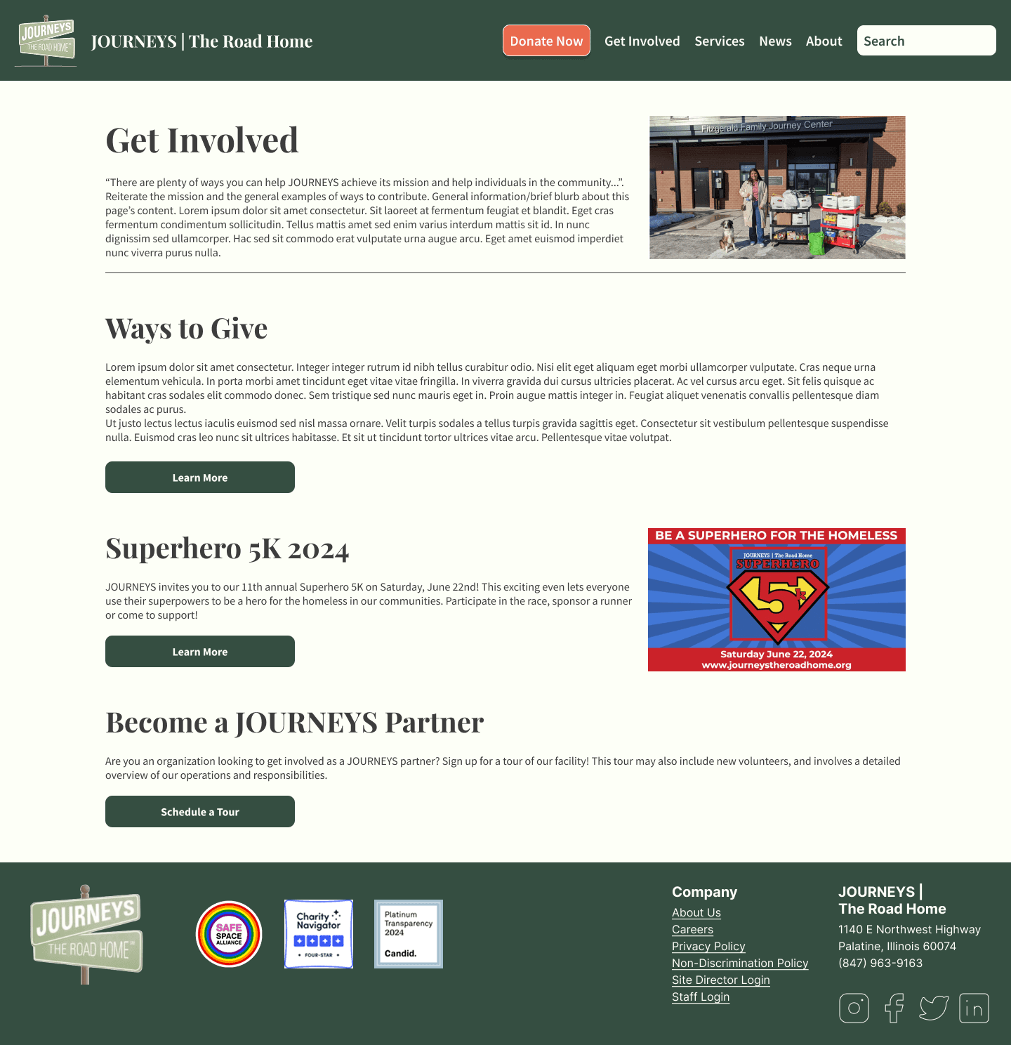
While developing the prototypes we aimed to reframe the and simplfy the navigation. making it easier for users to find what they need without unnecessary steps or confusion and provide a straightforward and efficient experience, ensuring users can quickly access information about the organization and seamlessly sign up to volunteer.
Wireframes
Hi-FI Prototype



Mobile
Desktop
User Testing
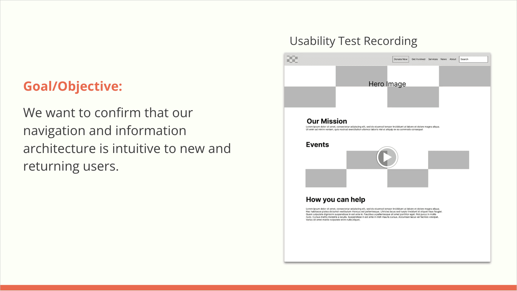
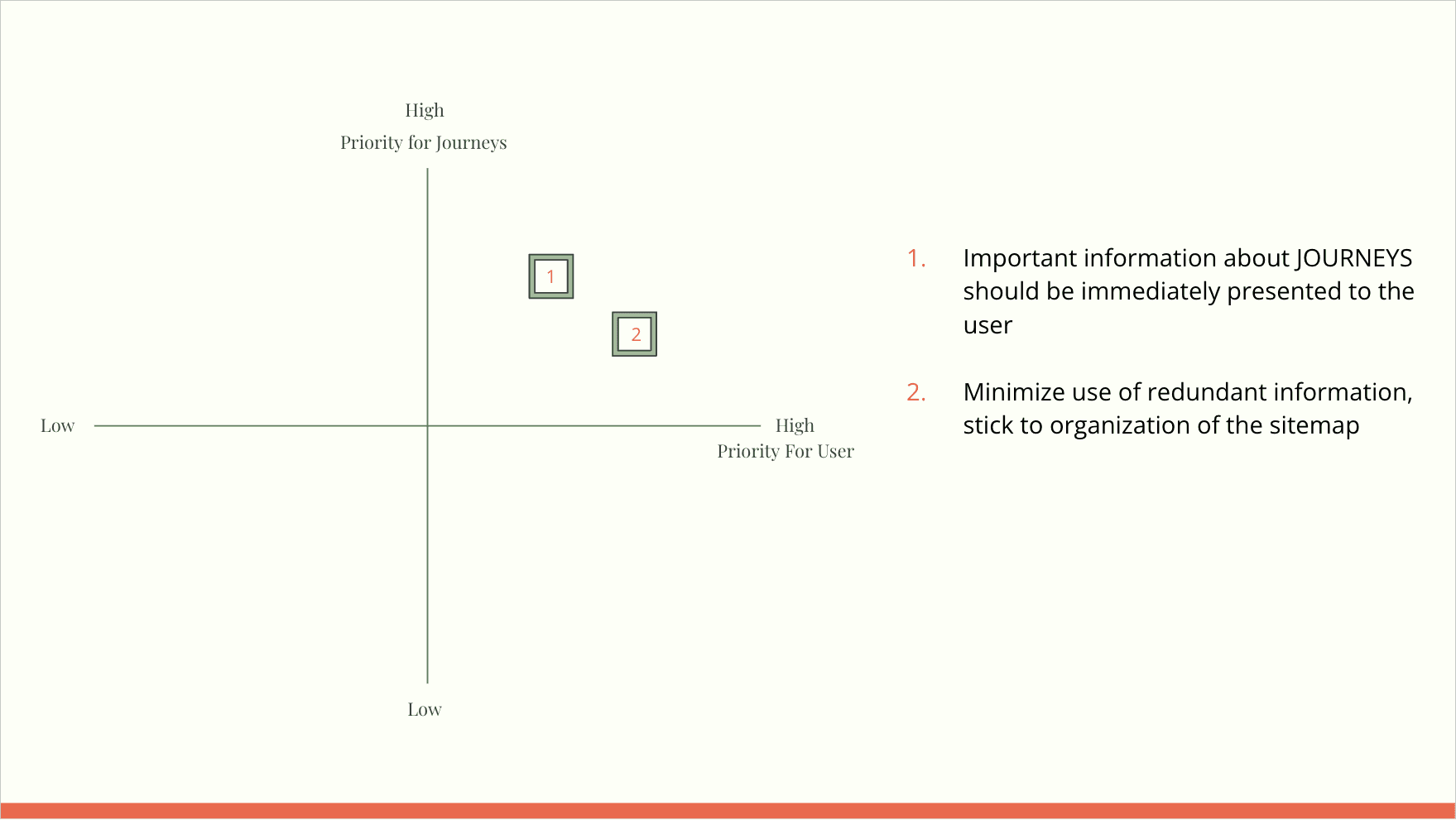
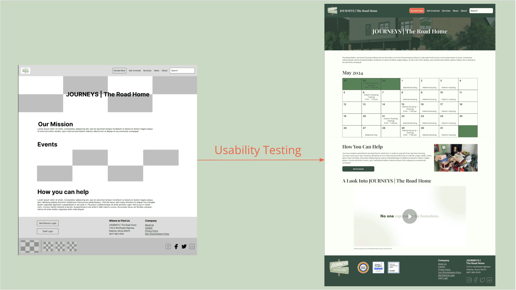
While testing we wanted to confirm that our navigation and information architecture is intuitive to new and returning users.
Testing
Results
Navigation Iterations

Homepage Iterations
Conclusion & Future Oppertunities
In the future our team would like to get in contact with a member of the orginisation to Confirm that the branding and messaging of the redesign aligns with that of the organization, and gain more user testing to better asses the interface with real users and donors. We do beleve our team maed great strides with the useability and concistancy of the site with our redesign.
Final Result
