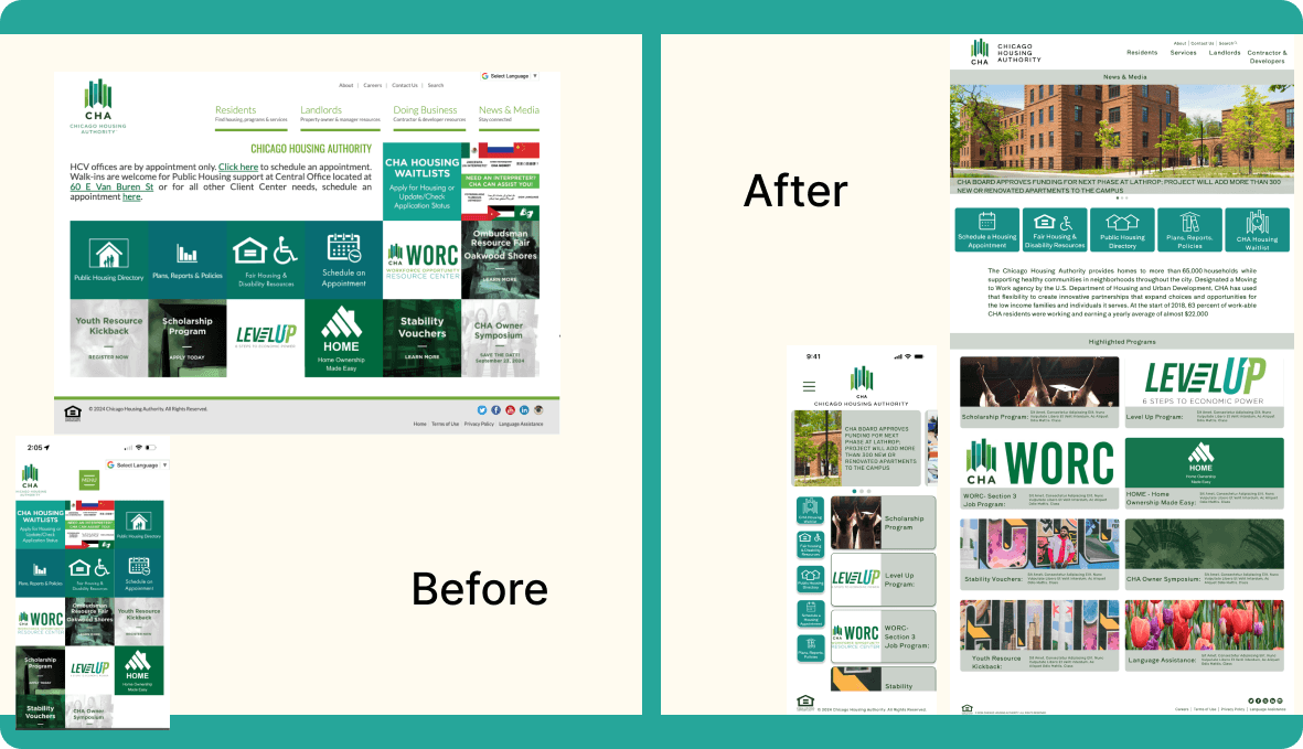
The Chicago Housing Authority (CHA) is a public housing agency in Chicago, Illinois, responsible for providing affordable housing options and related services to low-income families, individuals, and seniors. With the redesign, we aim to provide the site with a more user-friendly and understandable interface.
Overview
While looking at this site I discovered an assortment of useability discrepancies in the way this site was laid out and found certain information difficult to find. and started to look into the main tasks a user may visit this site to achieve and found them to be confusing or just downright difficult.
Problem
To combat the feelings of confusion, frustration, or distress, the user interface Illisited in our testers, the decision was clear. It was time for a redesign that took into account how a user interacted with the site and what they needed from it.
Solution
Figma, Google Drive, Zoom
Tools
UI UX Researcher & designer
(Individual Project)
My Role
3 weeks
Timeline
UX/UI Design
Wireframing & Prototyping
User Research & Usability Testing
Ux Techniques


User and Site Research
For our qualitative data 1-on-1 user interviews were conducted and recorded. The interviews lasted about a week.The notes obtained will be used to help focus the rebuilding of the site.
Research Questions:
What are the most prominent pain points of the current website?
What main purposes does the website serve to its users?
What tools can we provide to help our user navigate the site?
What can we do to make the information more digestible?
Research Plan

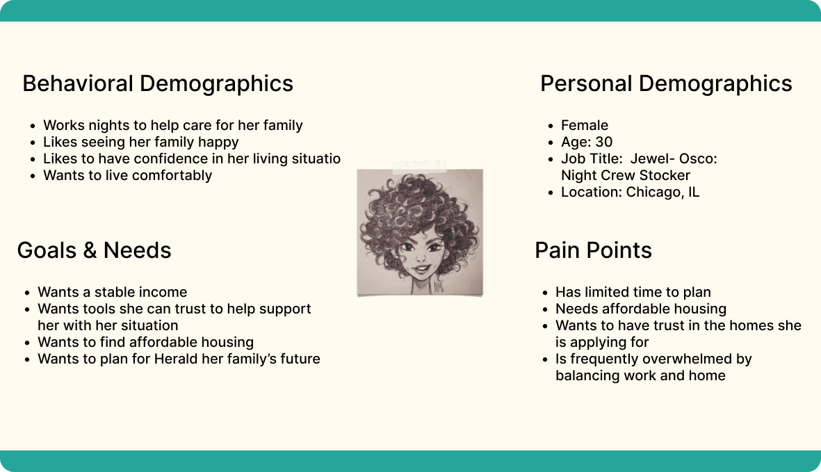
User Persona
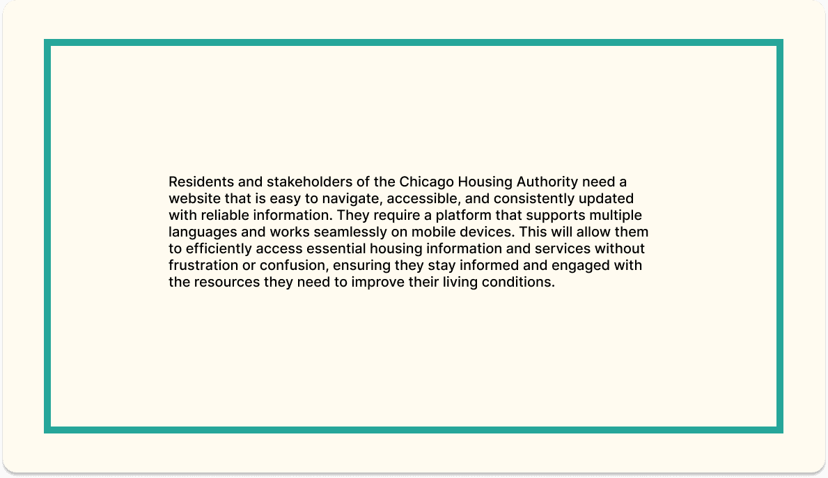
Problem Statement
Definition & Synthesis
The data from the research further shows that the Chicago Housing Authority (CHA) website currently faces significant usability issues and inefficiencies in the distribution of information, which hinder its ability to effectively serve the residents and stakeholders of Chicago.
Heuristic Evaluation

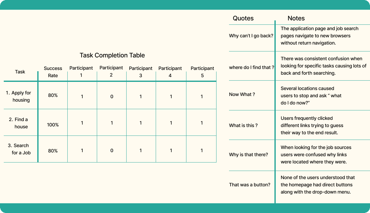
Original Site Testing

Original Testing Results
Annotated Navigation

Ideation
In the ideation phase was spent considering how to best improve the key usability concerns. Such as:
Enhance Usability: Create a clean, intuitive, and easily navigable interface that allows users to quickly find the information and services they need.
Improve Accessibility: Ensure the website meets or exceeds web accessibility standards to provide equal access for all users, including those with disabilities.
Streamline Information Distribution: Implement a robust content management system that ensures timely, accurate, and clear communication of important information.
Update and Maintain Content: Establish protocols for regularly updating content to keep information current and reliable.
Card Sorting
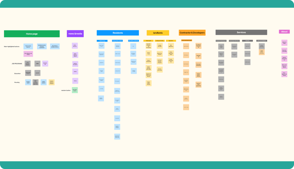
Site Map

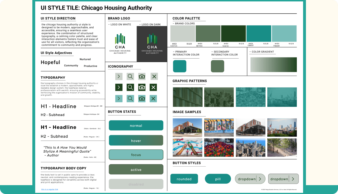
Style Tile
Prototyping
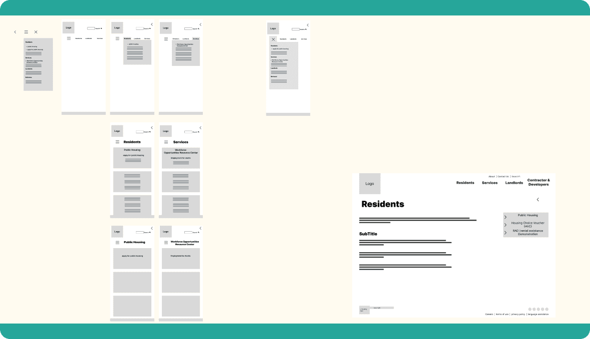
While prototyping one considers multiple versions of layouts to best address the usability errors found in the previous steps.Creating interactive prototypes to visualize and refine key features, incorporating user feedback at each stage.
Style Guide

Wireframe
Hi-FI Prototype

Testing
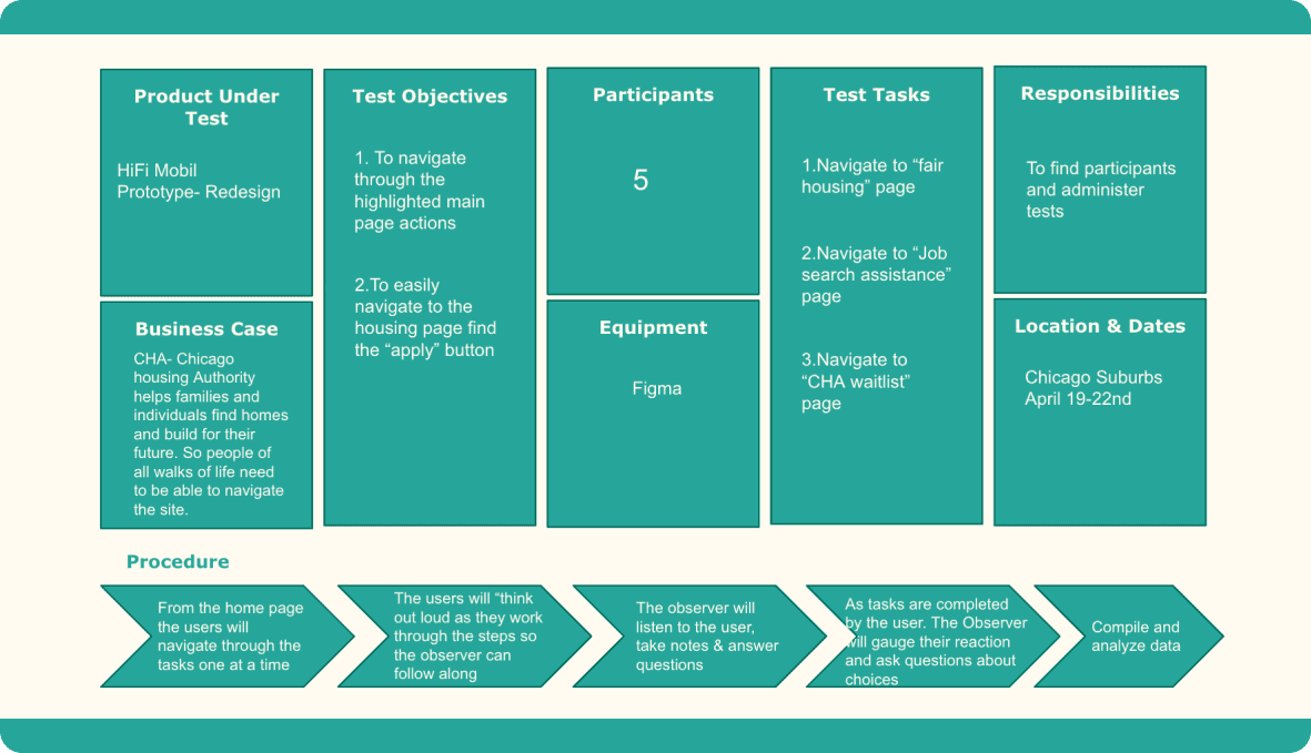
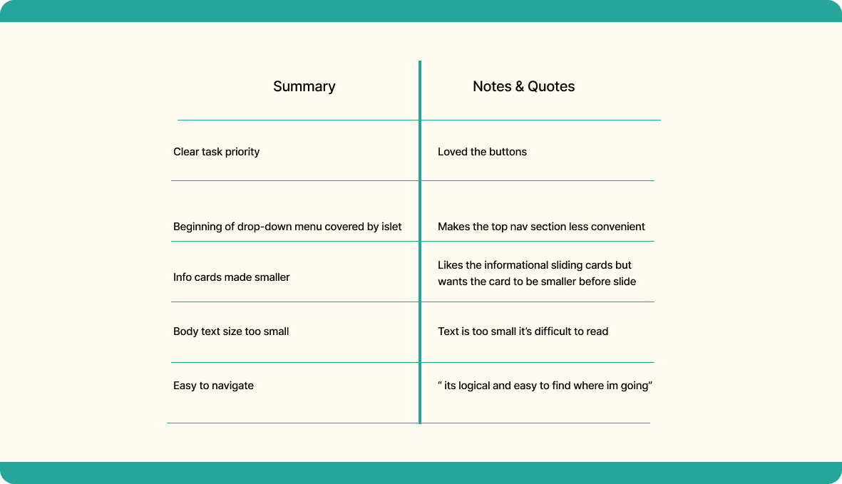
While testing the app we wanted to see how the users interacted with the new interface. while also monitoring how or if, the changes fixed the useability issues previously found.
Prototype Testing
Prototype Testing Results
Conclusion & Future Oppertunities
In the future, I would like to gain better data from the people who use the app most frequently to better define the hierarchy and simplify the main page. However, I do believe that this iteration provides a significant positive shift in the path of the site's useability.
Final Result
